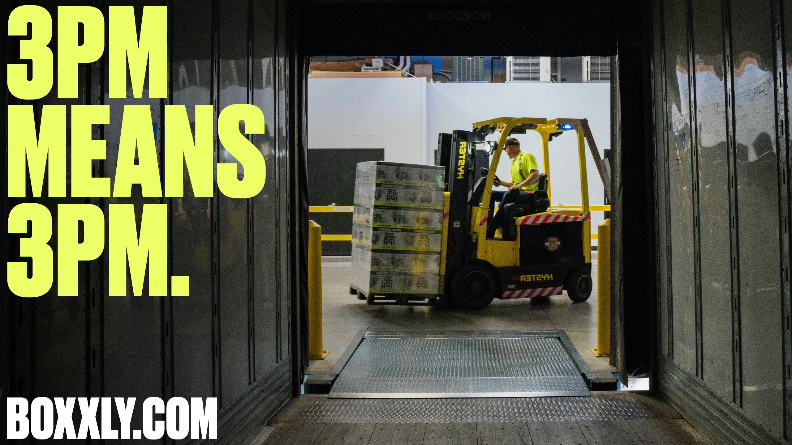
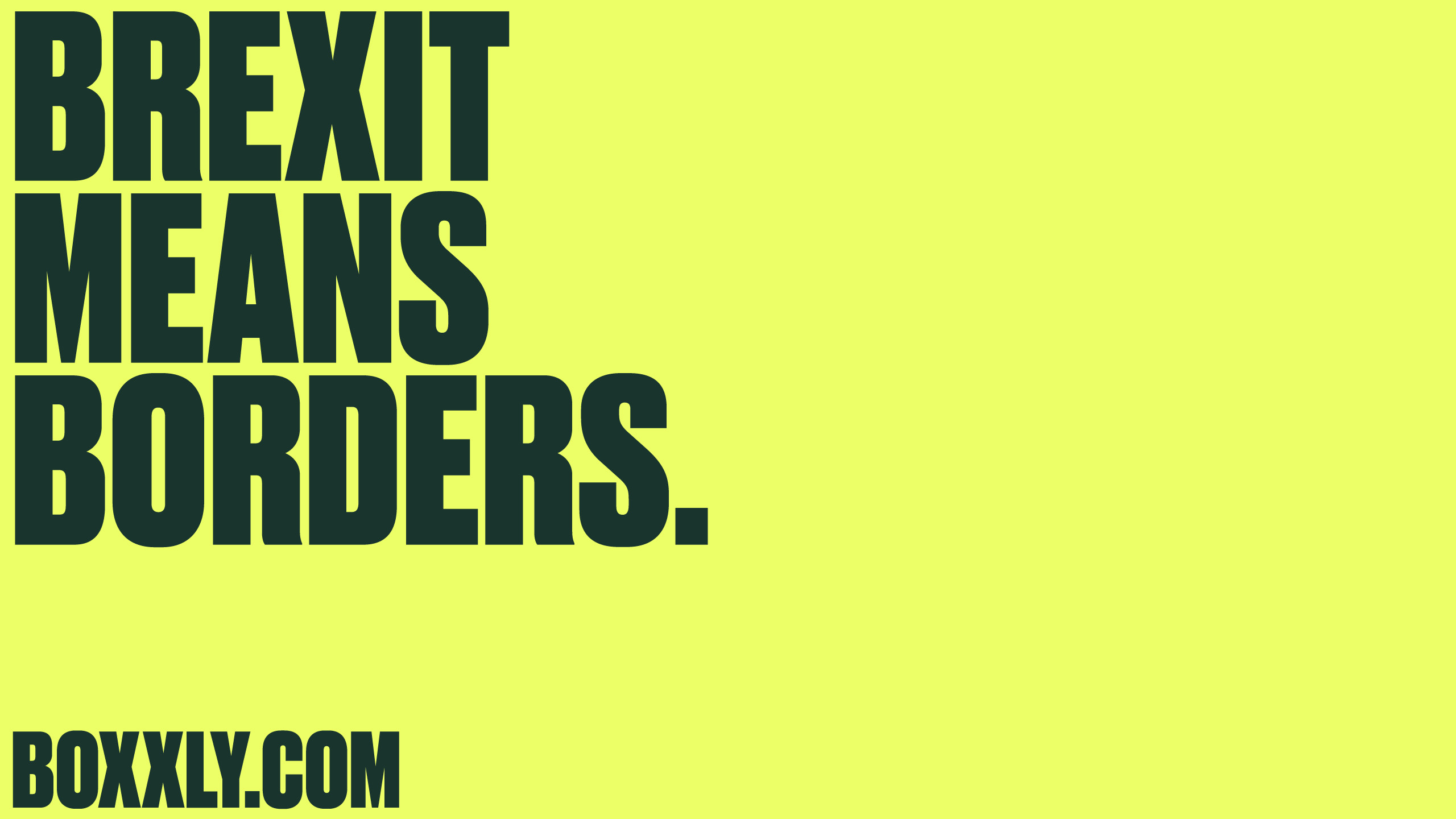
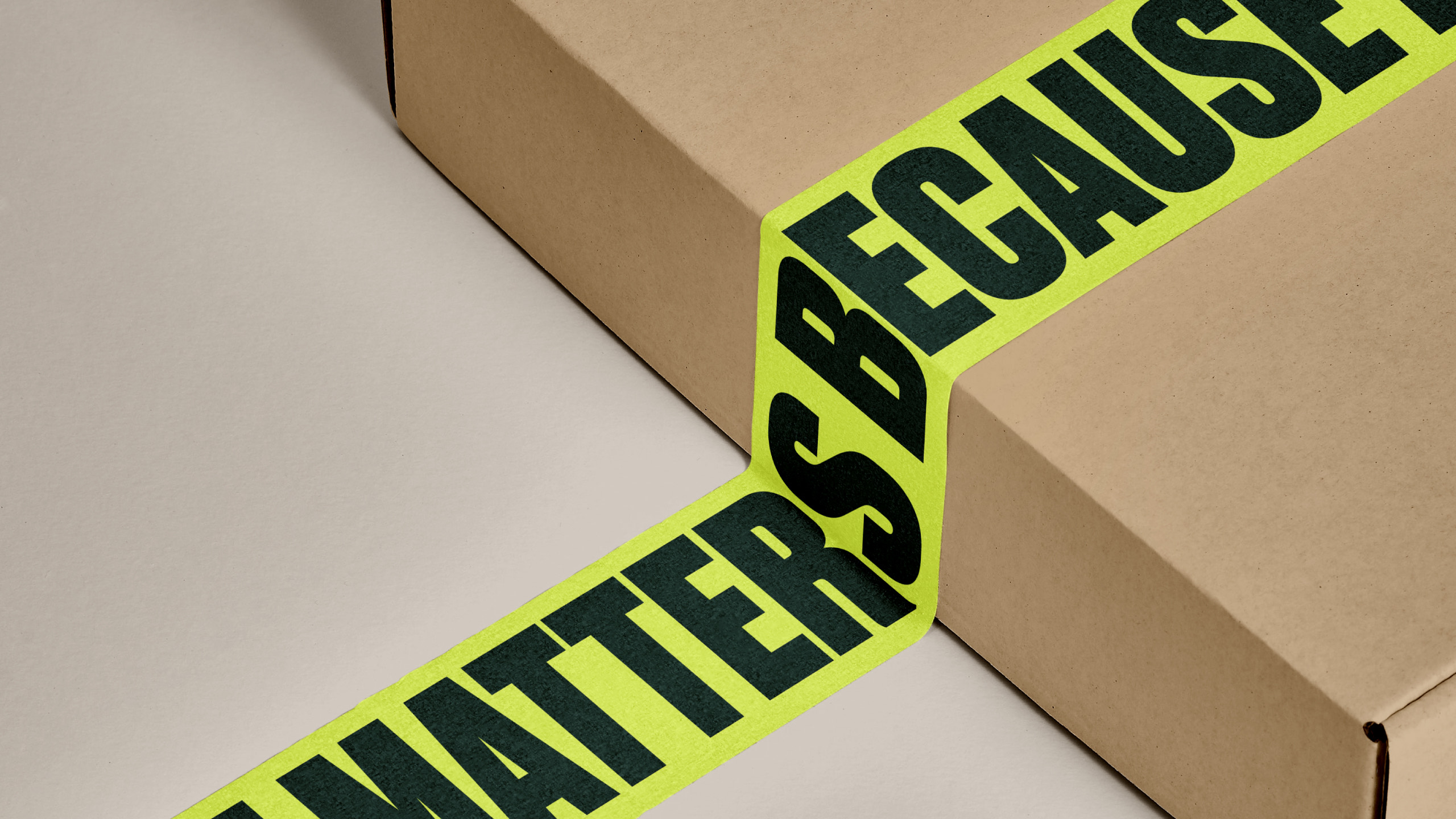
Boxxly are a logistics platform designed for high-volume parcel consolidators who need to scale their offer to meet increasing demand. Their existing positioning, both visually and verbally, was not resonating with their customers. A new proposition, 'because it matters', was developed to speak directly to logistics employees, capturing the sense of urgency and importance their roles demand.
Client: Boxxly
Sector: SaaS / Logistics
Year: 2021
Agency: Design by Structure
Role: Graphic Design, Art Direction, Design Direction
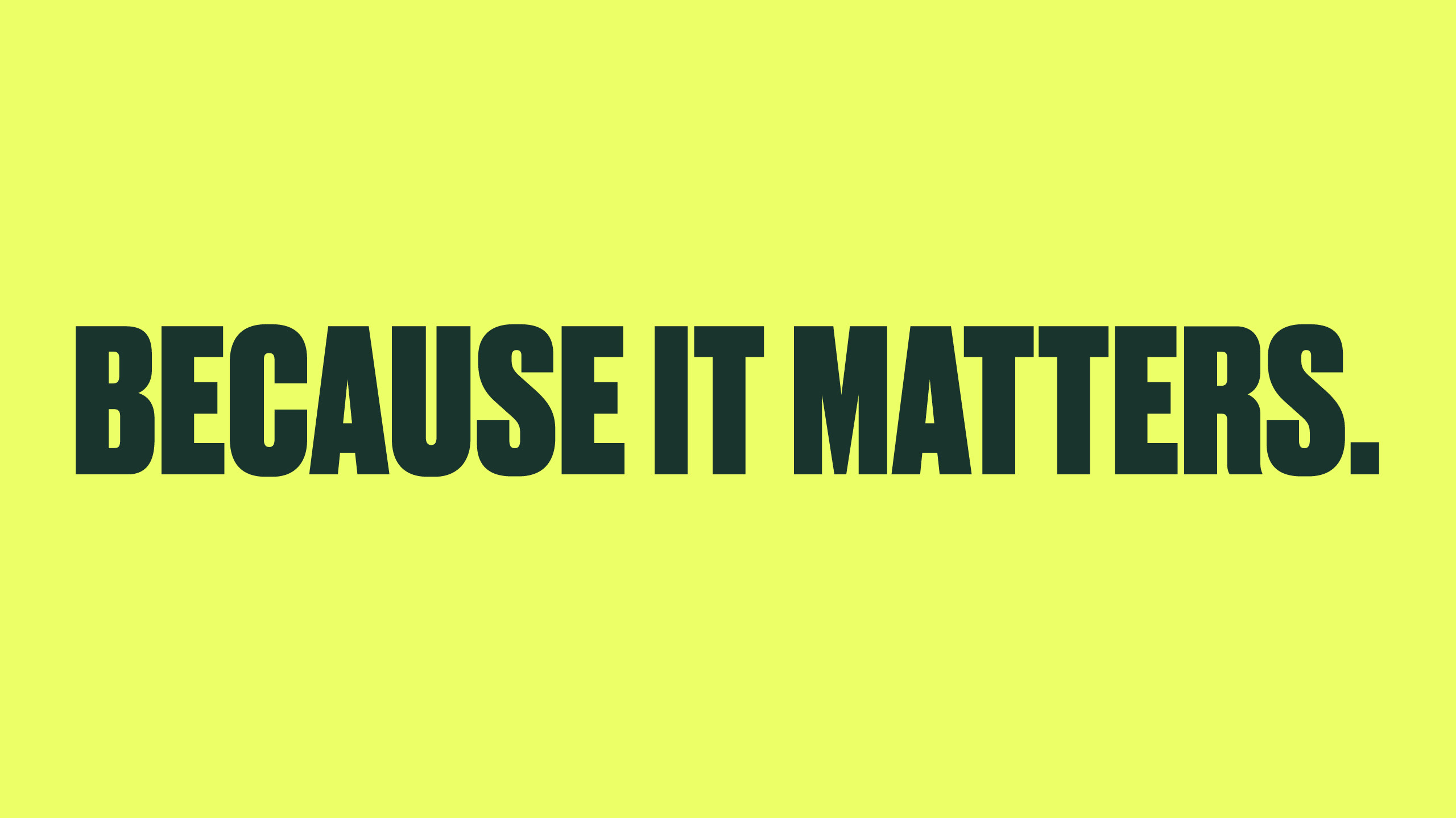
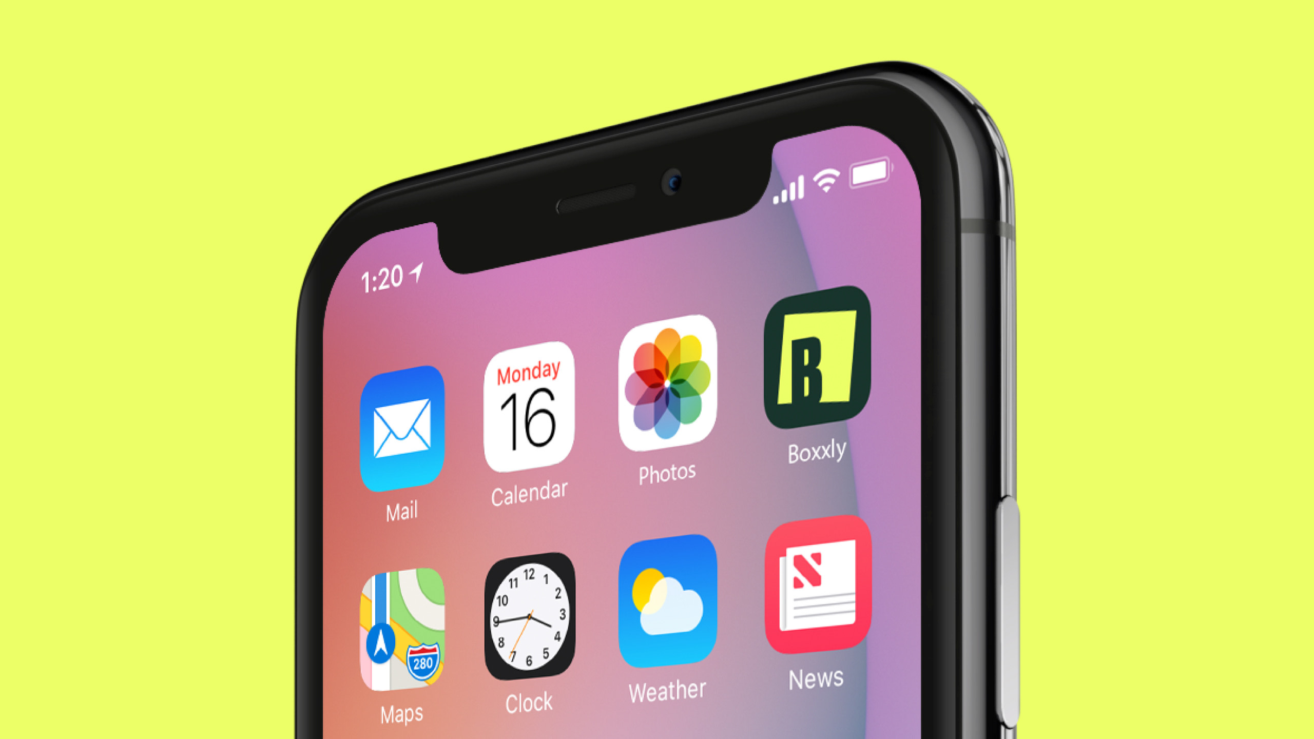
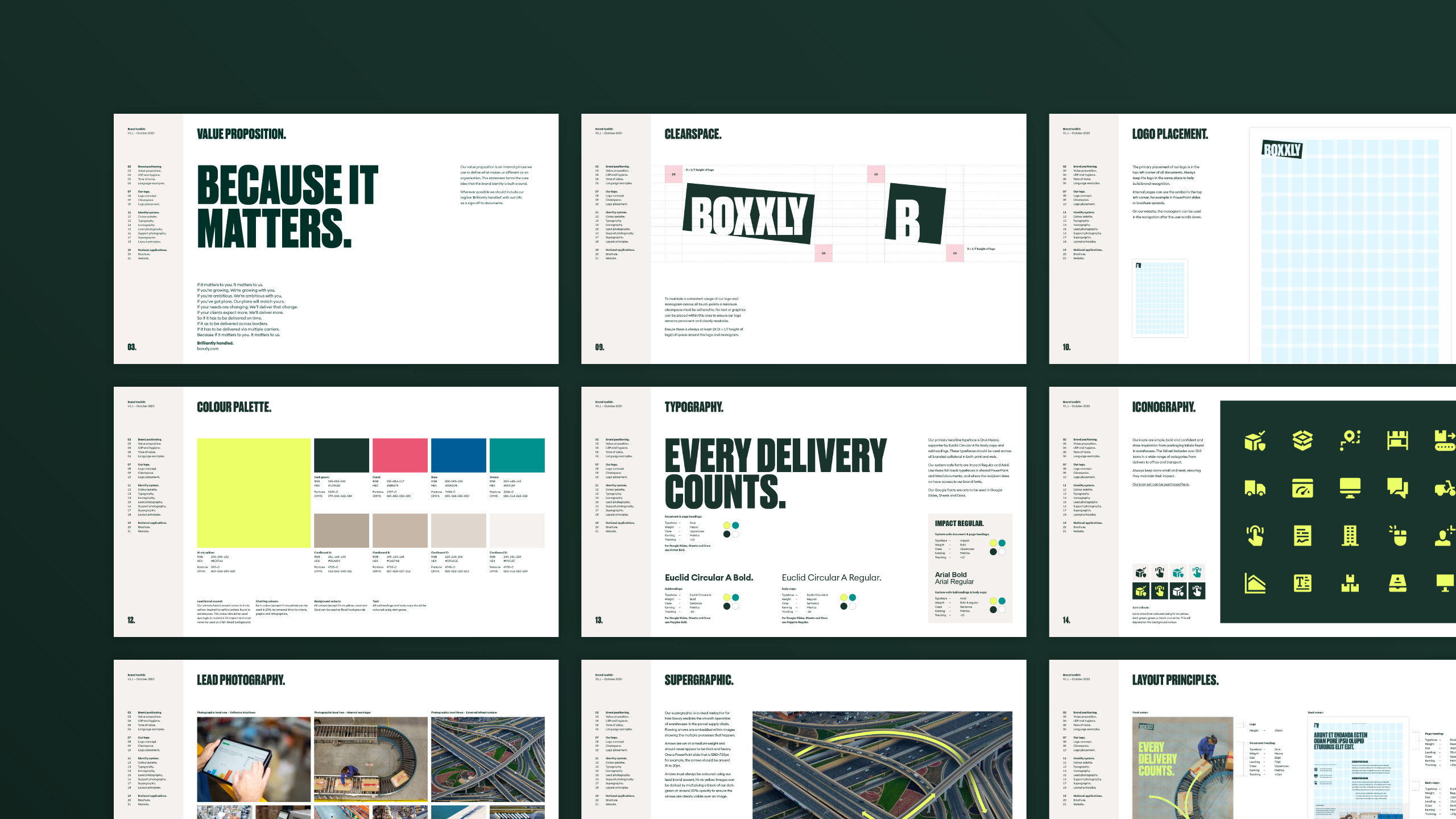
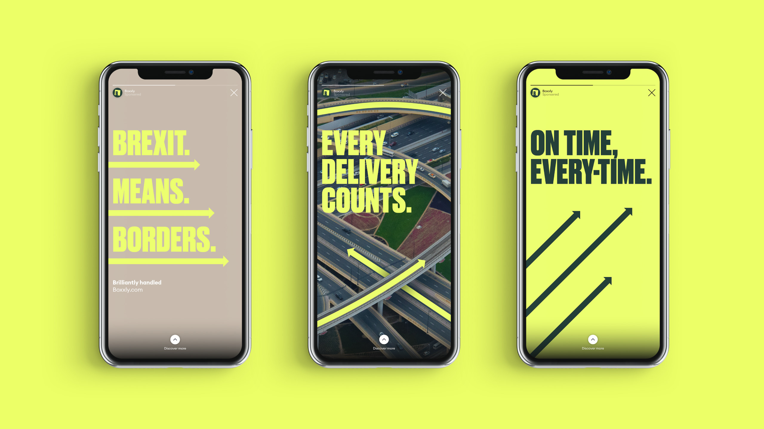
Boxxly's new brand identity was crafted to reference the warehouses where their customers work. The colour palette was inspired by the fluorescent greens of hi-vis jackets, with soft browns and greys taken from the packaging materials used to safely transport goods. An icon language and bold typographic treatment was also developed referencing these materials.
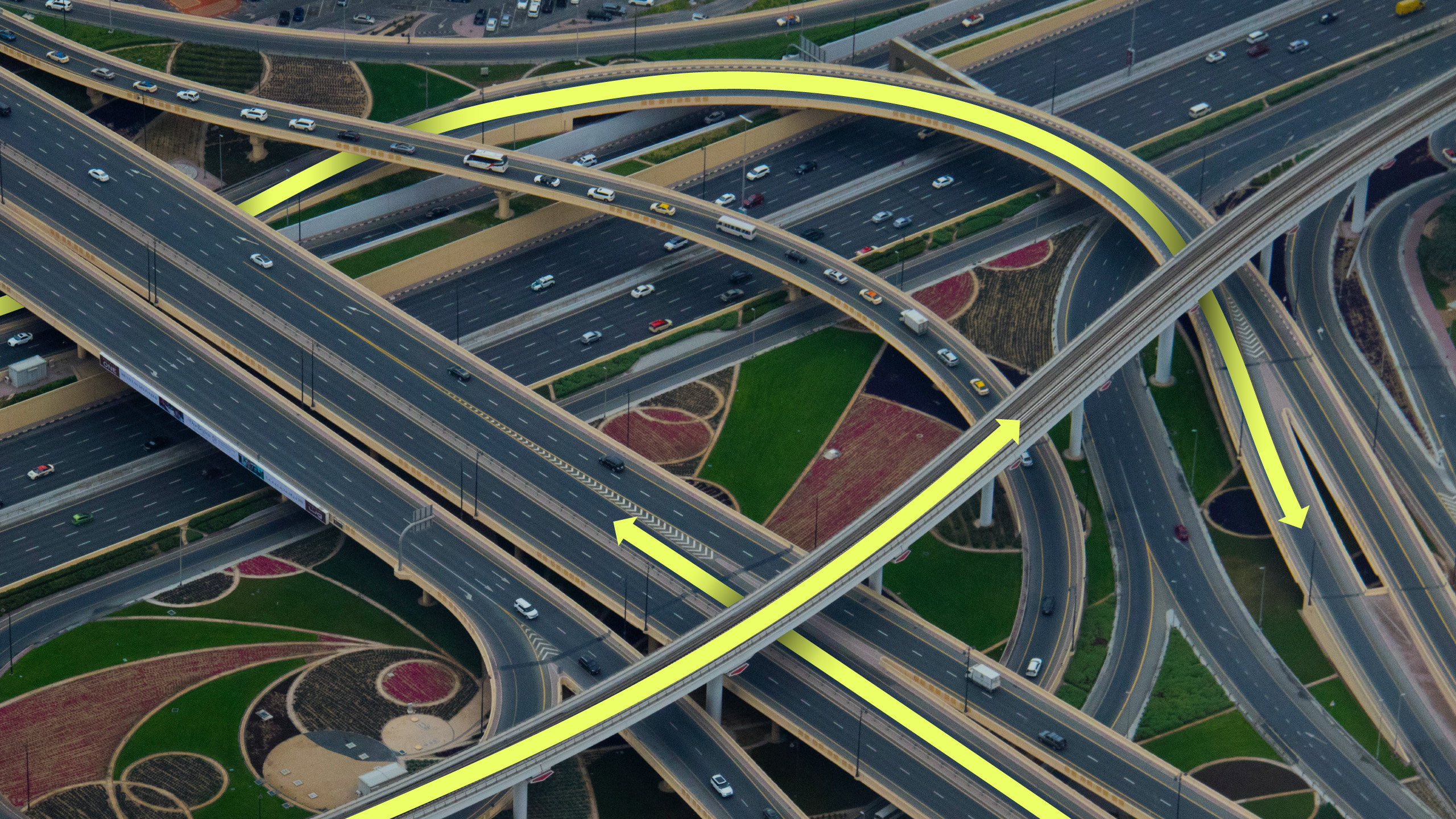
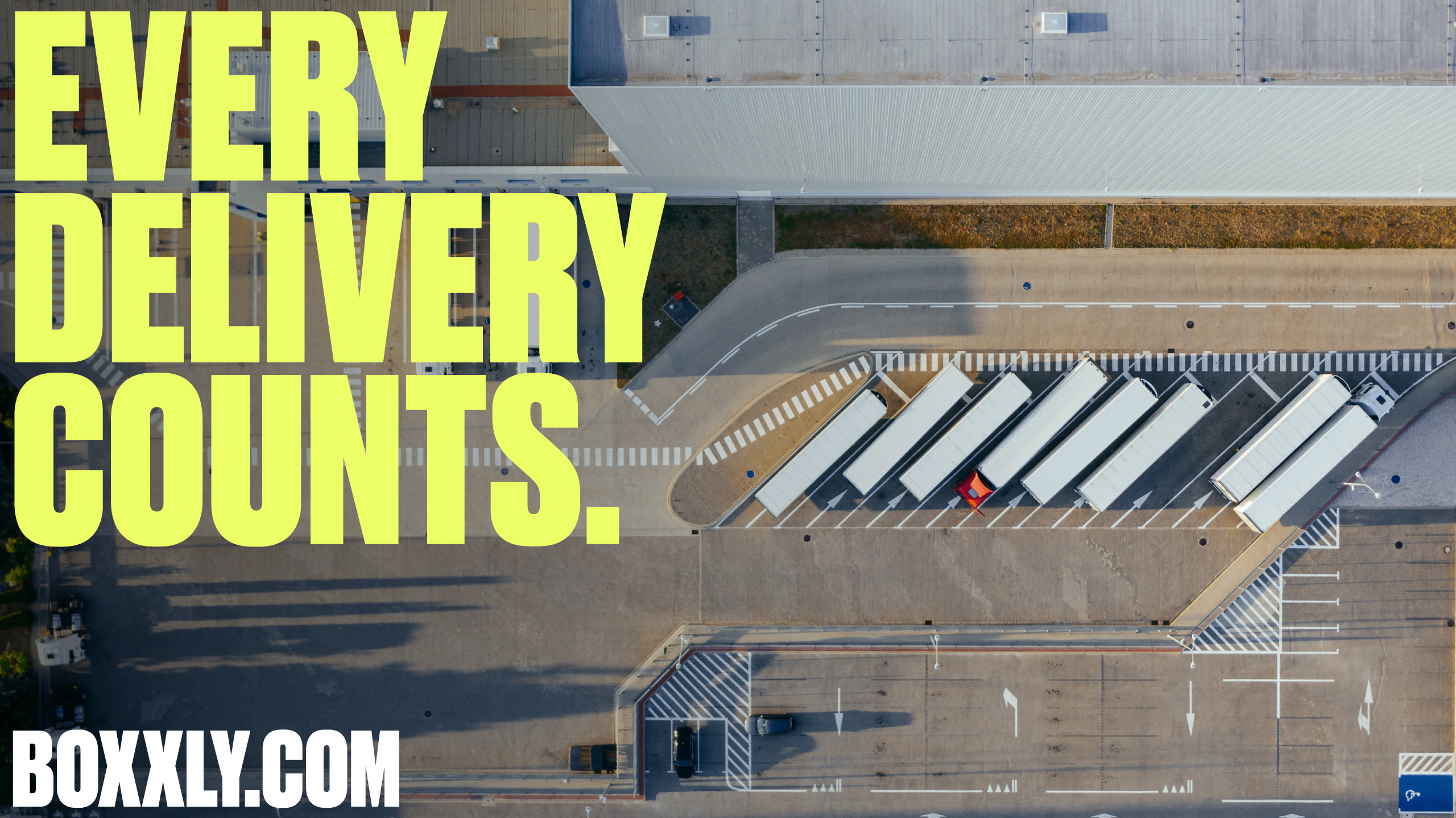
The primary brand asset, a bold supergraphic constructed from arrows and heavy lines, hints at the processes, onwards journeys and smooth operation of the warehouse. The supergraphic, paired with punchy headlines reflecting key customer pain points and a bold colour palette creates a confident and relevant identity system.