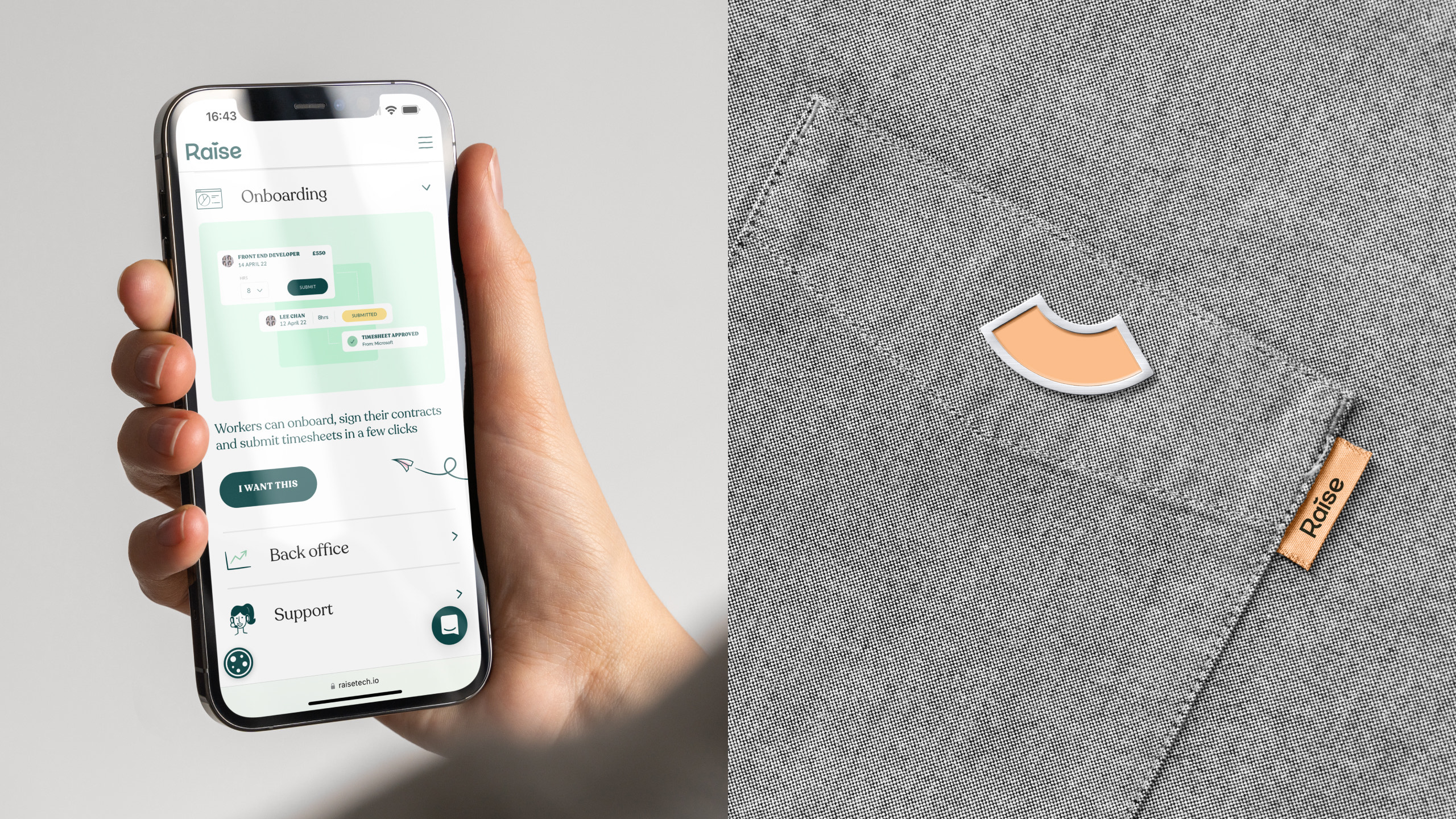
Raise are a fintech provider working with recruiters to provide invoice factoring, financing and business support empowering them to thrive. Co-founded in 2017 by Tim Bailey and Bea Stafford under the name 1PS, the business had ambitious plans for growth which demanded a new name and brand identity to communicate this to their customers and future prospects.
Client: Raise
Sector: Fintech / Recruitment
Year: 2022
Agency: Design by Structure
Role: Graphic Design, Art Direction, Design Direction
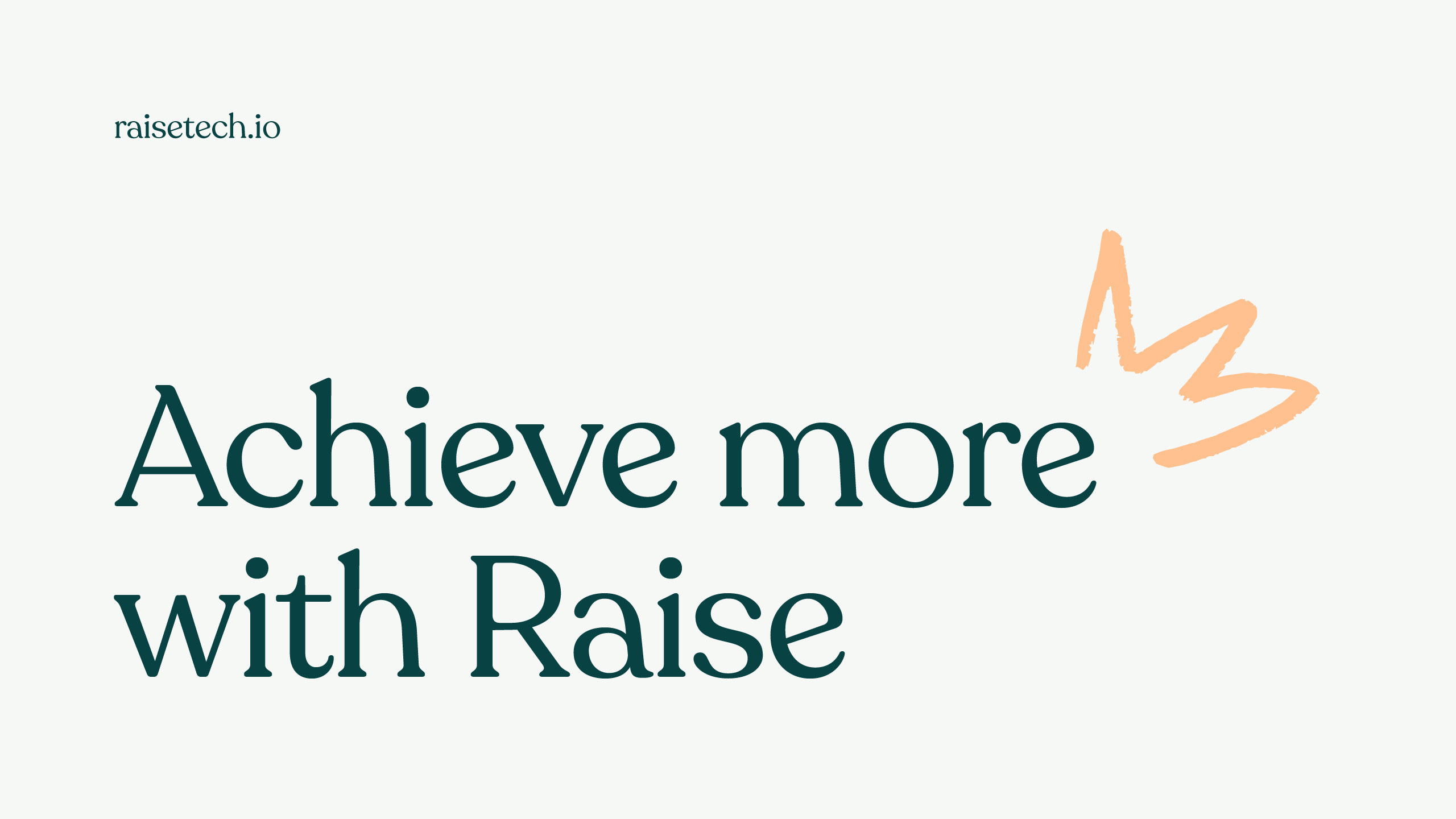
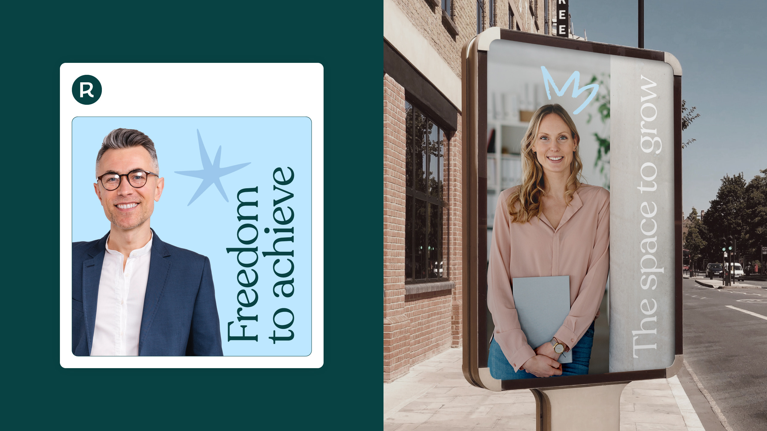
This ambition was crystallised through a new value proposition, achieve more, that speaks of the positive impact and outcome of their partnership with their customers. This was further reinforced by a new name, Raise, a clear statement of intent of the value the company brings.
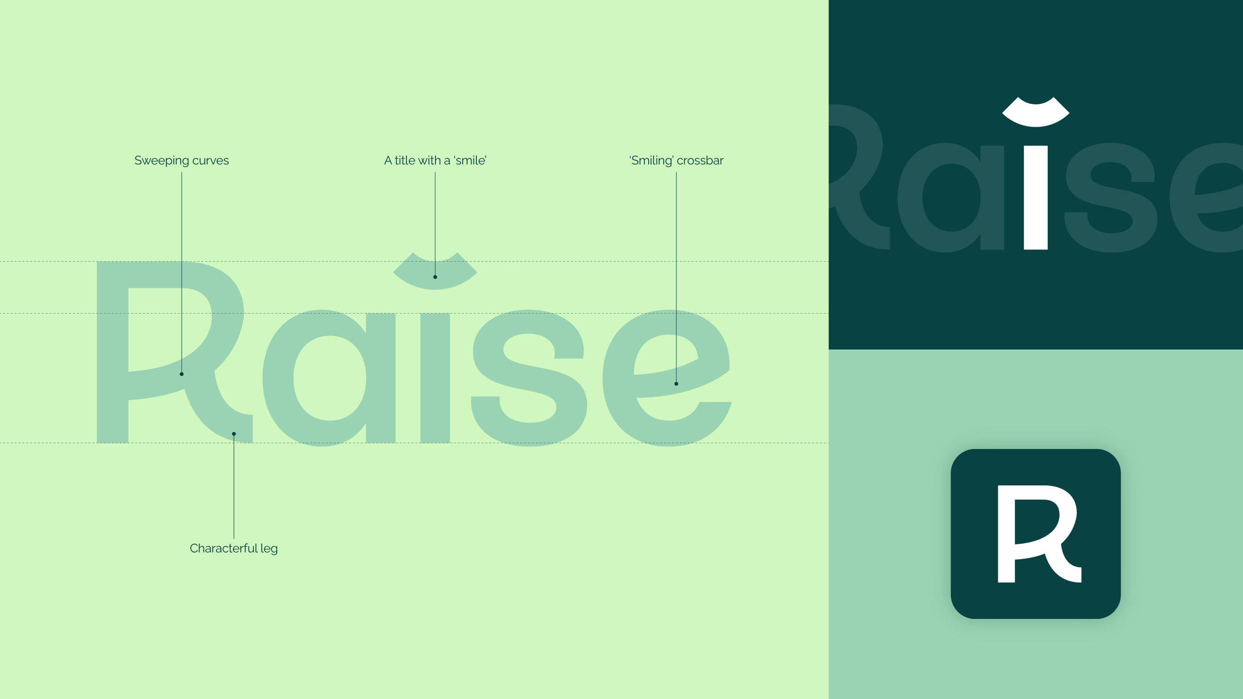
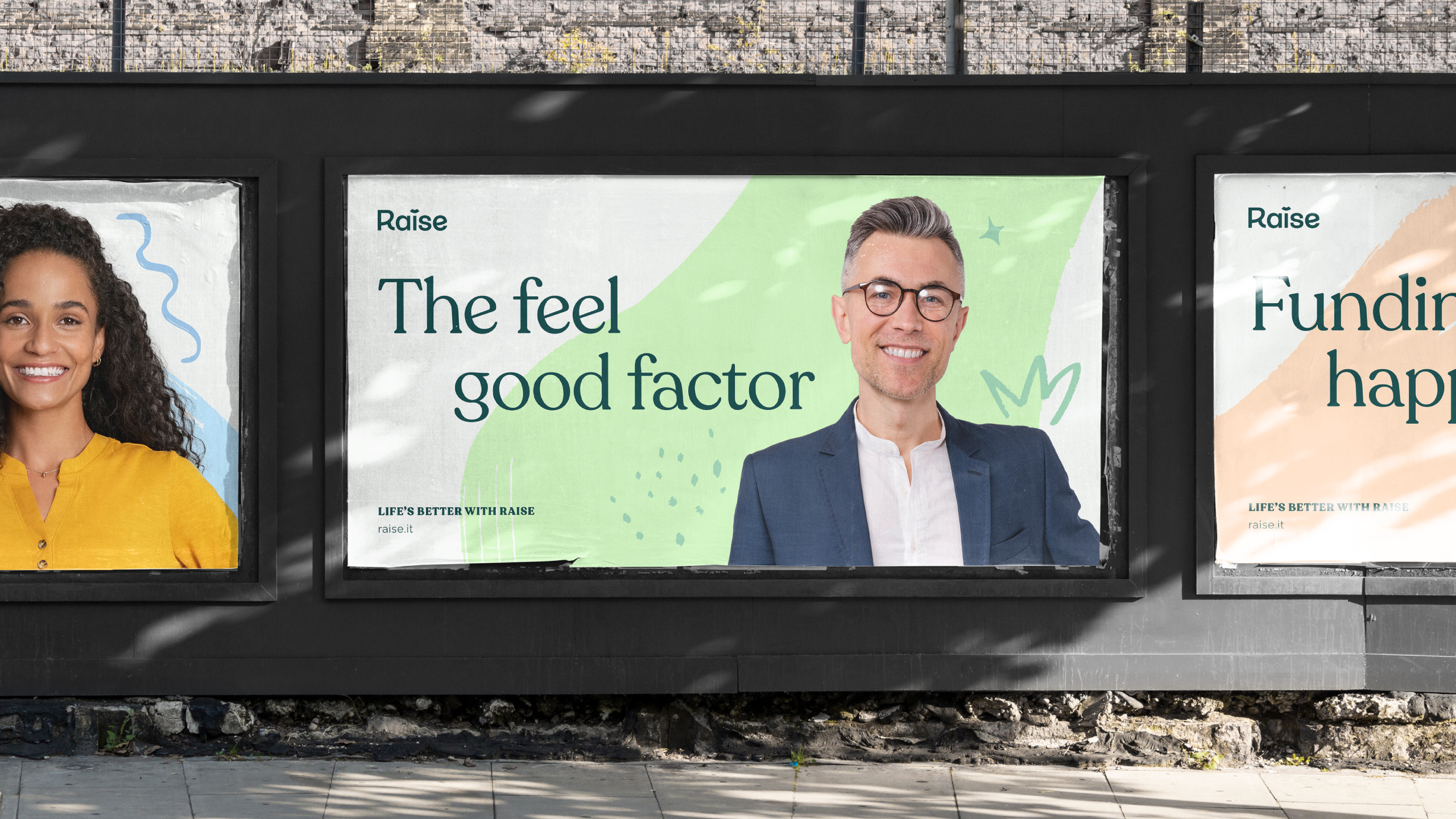
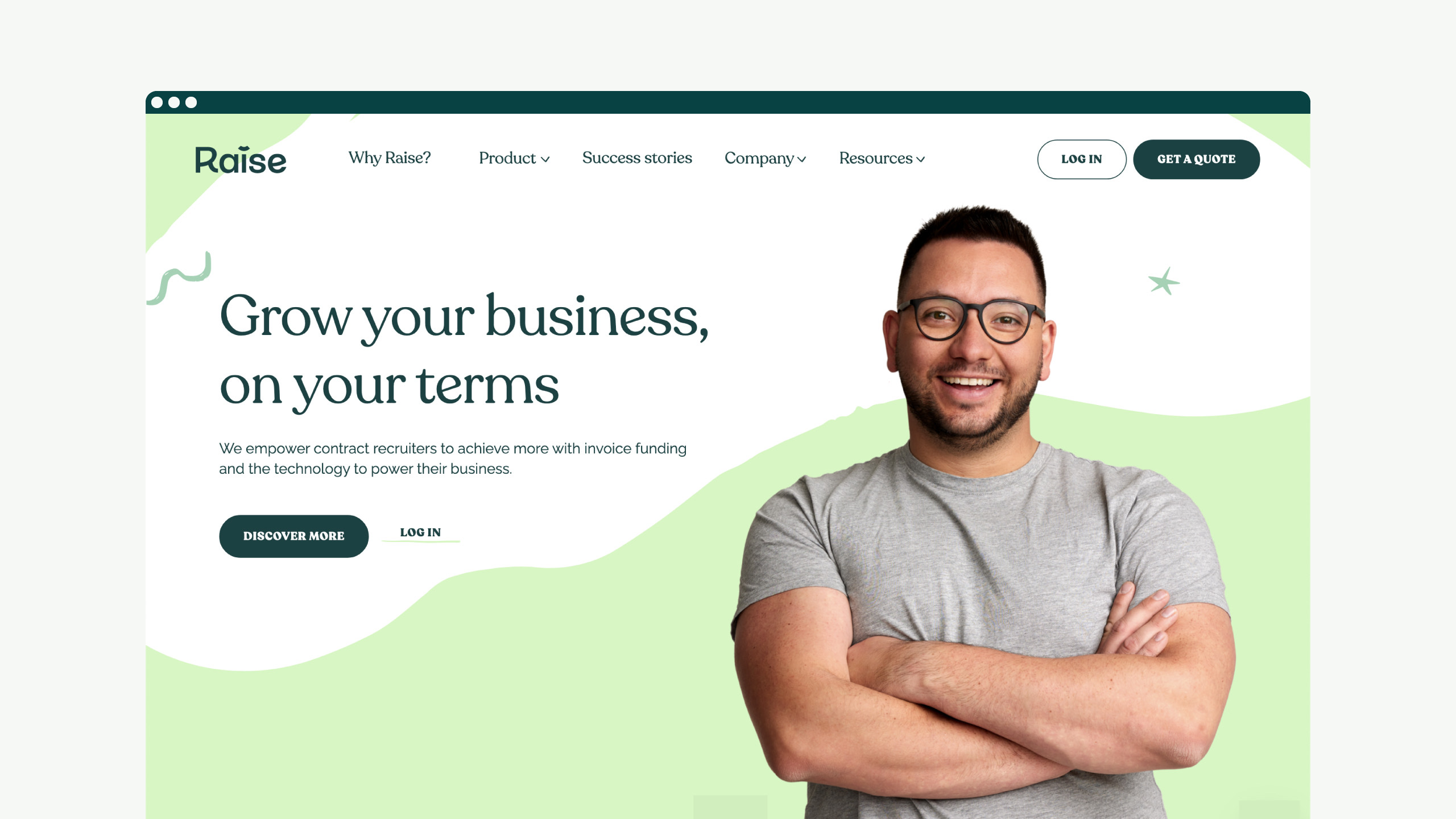
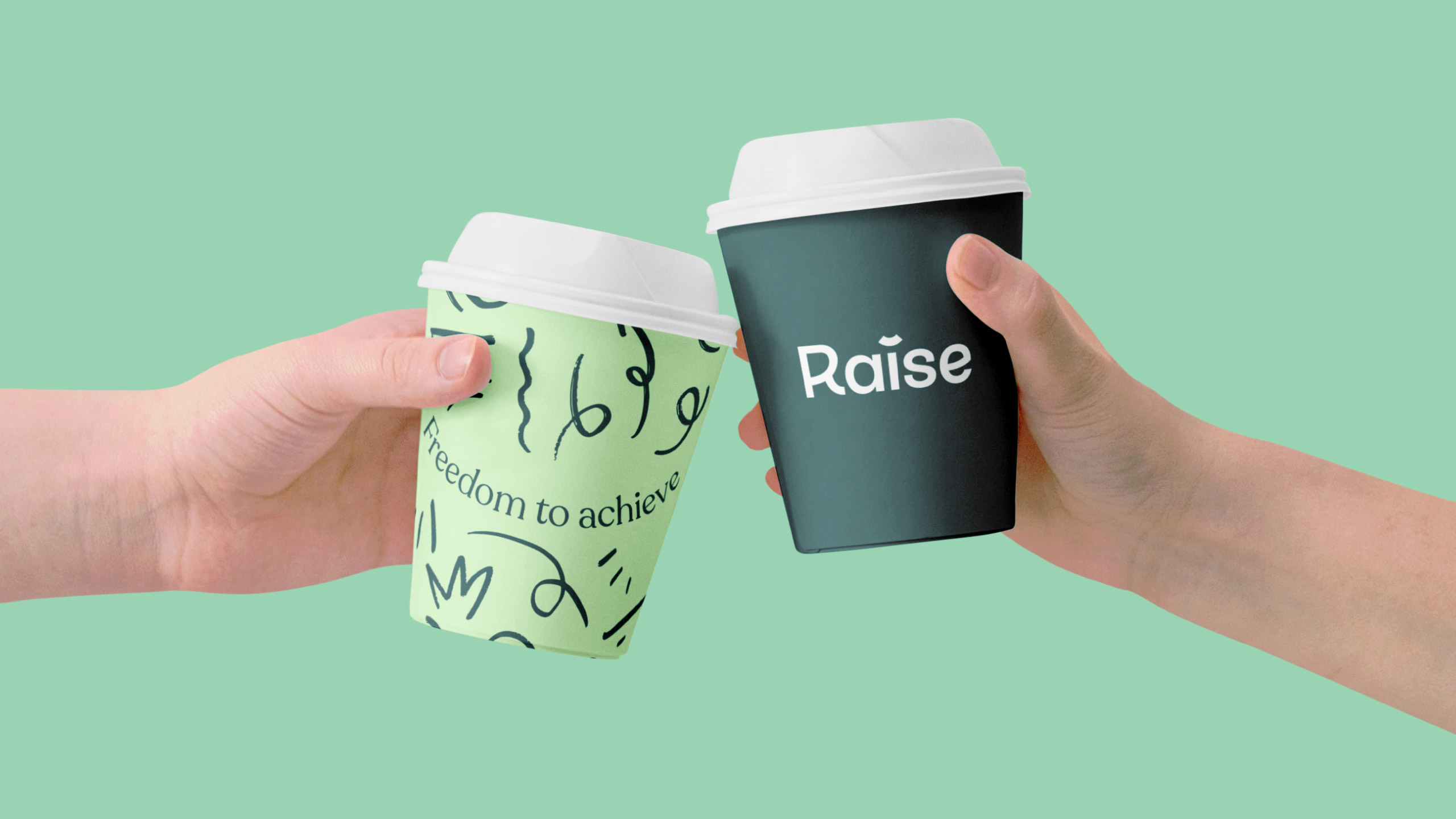
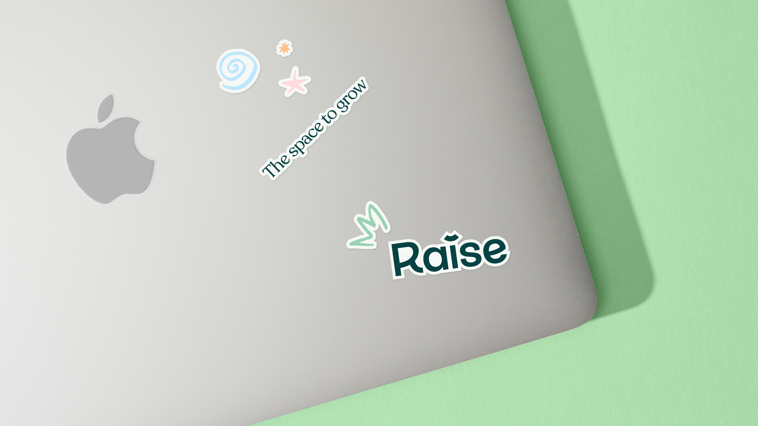
The brand identity was designed to be energetic, focusing on the effect of achieving more. Colours are bright, typography is playful, and the lead supergraphic, a bold set of confetti patterns, adds a celebratory element to the identity. The logotype leads with a friendly smile replacing the tittle of the 'i', with both crossbars of the 'R' and 'e' following suit.
This, combined with an extensive set of custom and sourced brand assets, gives Raise the flexibility to quickly communicate their new vision and ambitions helping them to grow.
